HawkFlow.ai UI pages components
Trends Page
The Trends page is designed to inform you of any processes that are trending longer or shorter referring to the time they take to complete.
Trend detection works over a seven, fourteen and a thirty day period.
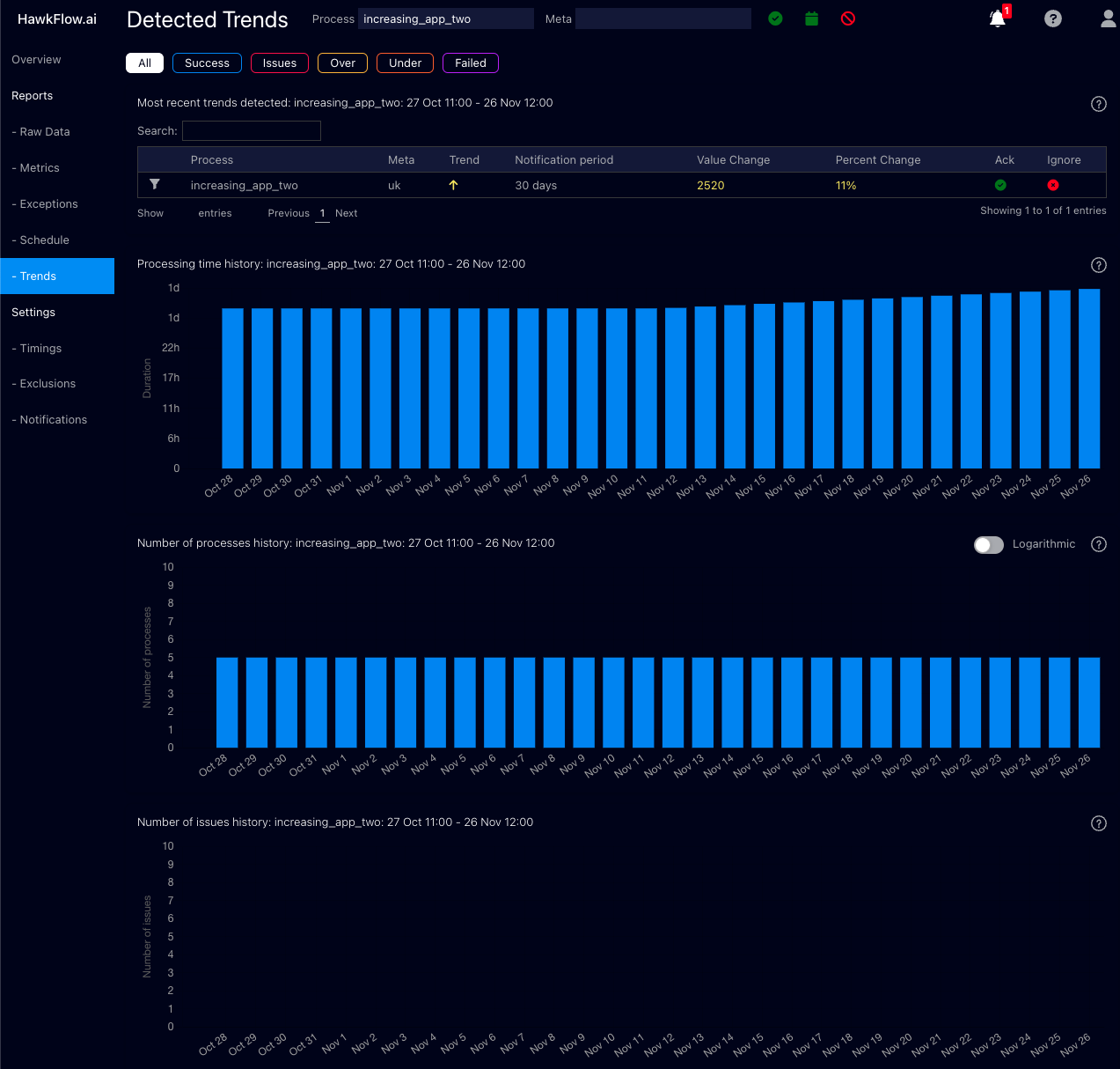
Most recent trends table
The recent trends table shows you the details of any trends found.
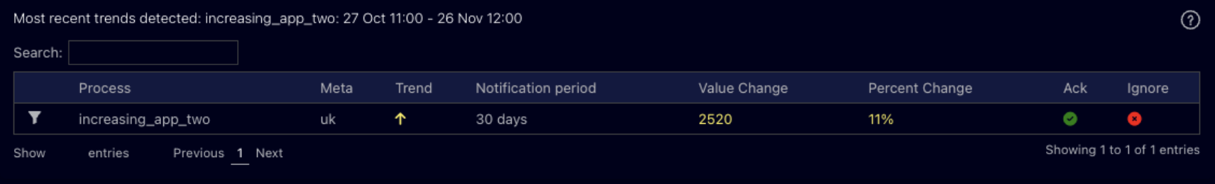
Number of Processes History
This chart allows you to recognise patterns over a longer period of time in how many processes you are running. You can quickly see if you have a spike or a drop in the number of processes that are running. Often the first sign that there is an issue in your system.
Each bar shows you the number of processes started in the chosen time range.
A process running faster than normal will be represented by an orange bar. A process taking longer than normal to run will be represented by a yellow bar, and a process running with its normal time range will be represented by a blue bar.
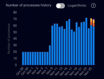
Processing Time History
This chart allows you to recognise patterns over a longer period of time in the length of time that processes run for. You can quickly see if you have a spike or a drop in the time processes are taking to complete. When used together with the number of processes chart, this allows you to quickly understand if there is an issue in your system.
Each bar shows you the number of processes started in the chosen time range.
A process running faster than normal will be represented by an orange bar. A process taking longer than normal to run will be represented by a yellow bar, and a process running with its normal time range will be represented by a blue bar.
A failed process will be represented by a purple bar.
Number of Issues History
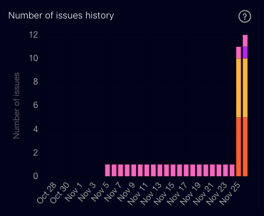
The daily issues chart shows you number of issues your processes are having each day. As with other charts, the orange bars represent a process running faster than normal. A yellow bar represents a process running slower than normal, a failed process is represented in purple, and exceptions are in pink.