HawkFlow.ai UI pages components
Metrics Page
The Metrics page is designed to give you all the information you need about any Metrics that you send to the HawkFlow.ai Metrics API.
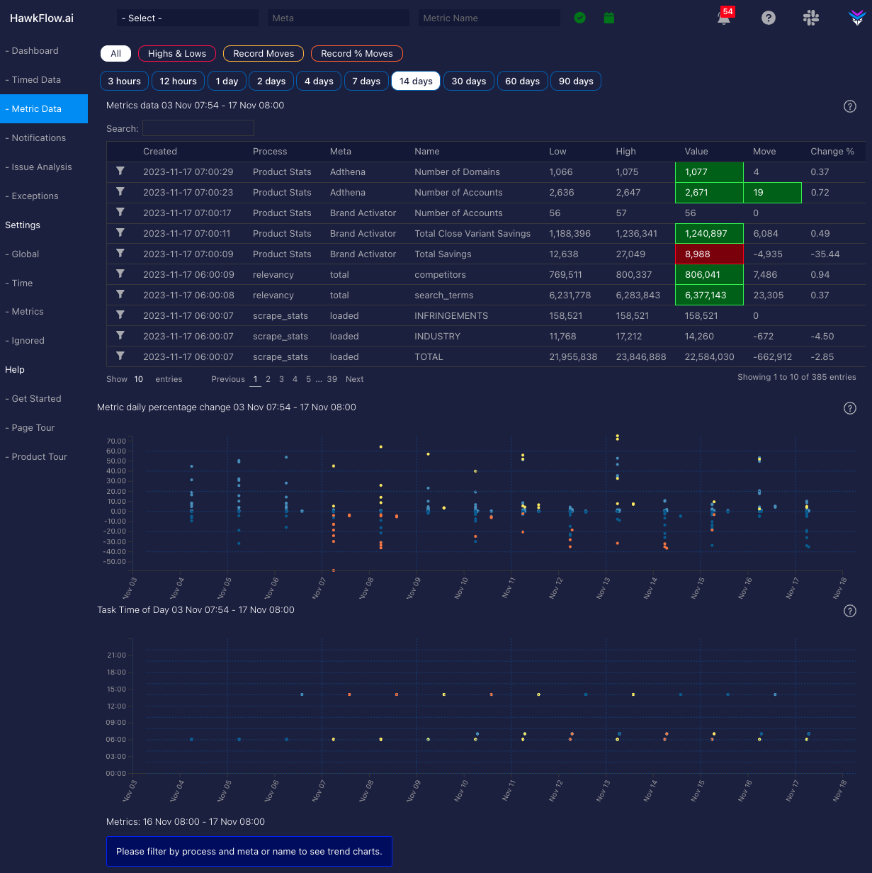
Metrics Table
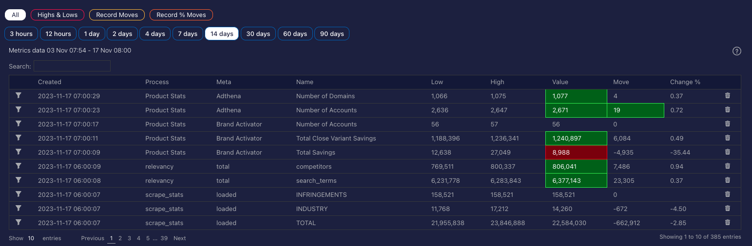
The metrics table gives you all the individual details of each metric you are sending in to the HawkFlow.ai metrics API. You can see the latest values, highs, lows, and percentage changes. Clicking on the filter on the left of the table will filter the page by this metric and show the daily value charts below.
Metrics Daily Percentage Chart
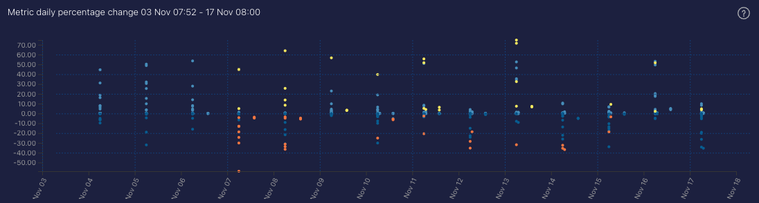
This daily chart shows you the percentage change for each of the metrics you are sending in to the HawkFlow.ai metrics API. The dots will normally be blue. If there are yellow or orange dots on the chart, this represents that the metric has made a new biggest move up or down. This chart lets you quickly see whether there are potential issues in your data. Clicking a dot will filter the page by the clicked metric.
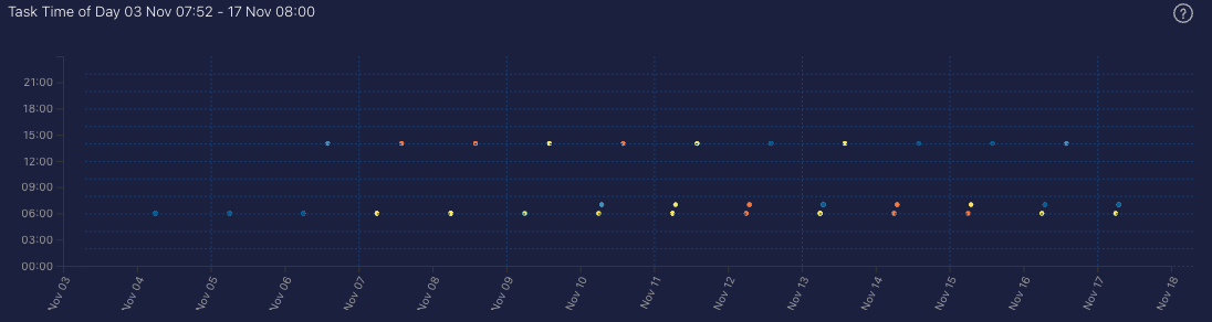
Metrics Daily Time of Day Chart
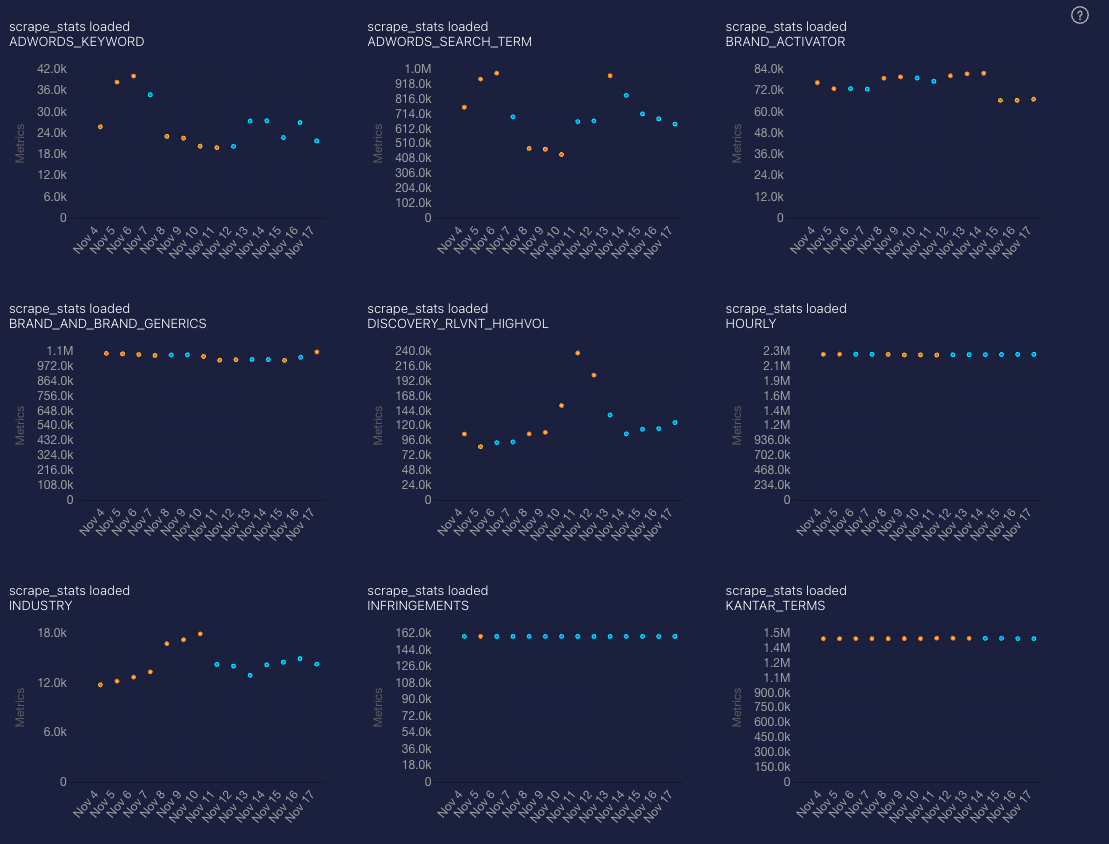
Metrics Daily Value Charts