HawkFlow.ai UI pages components
Timed Data Page
The timed data page lets you see the details of every process that you have sent the HawkFlow.ai Timed API.
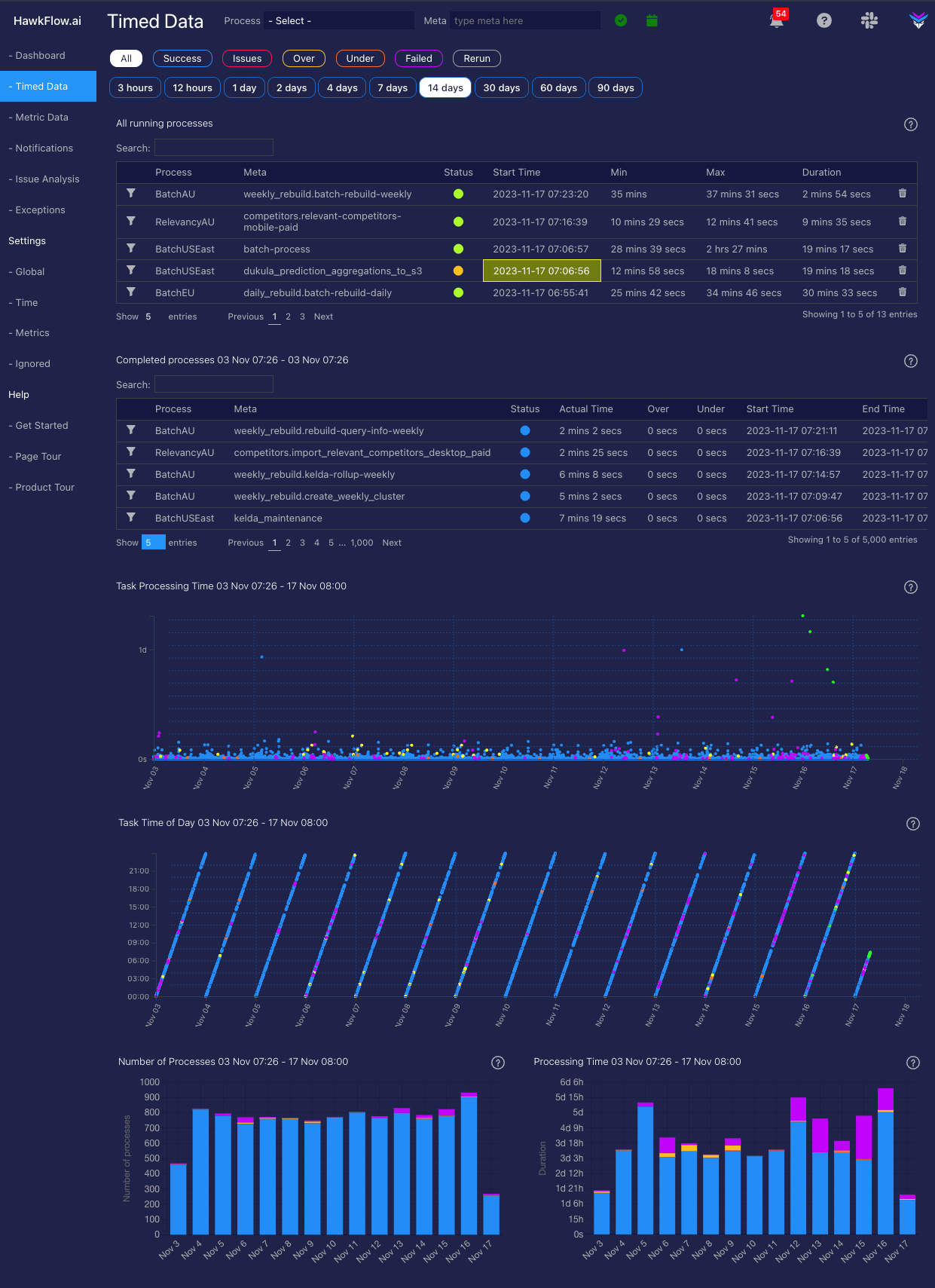
Running Processes
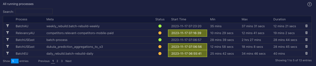
The running table shows the details of any process sent to the Timed API that are running at the time you view it.
Completed Processes
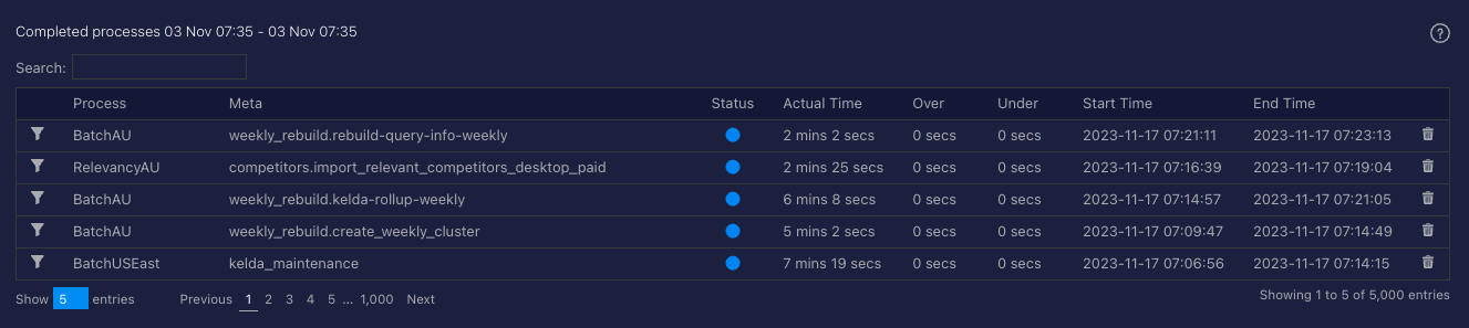
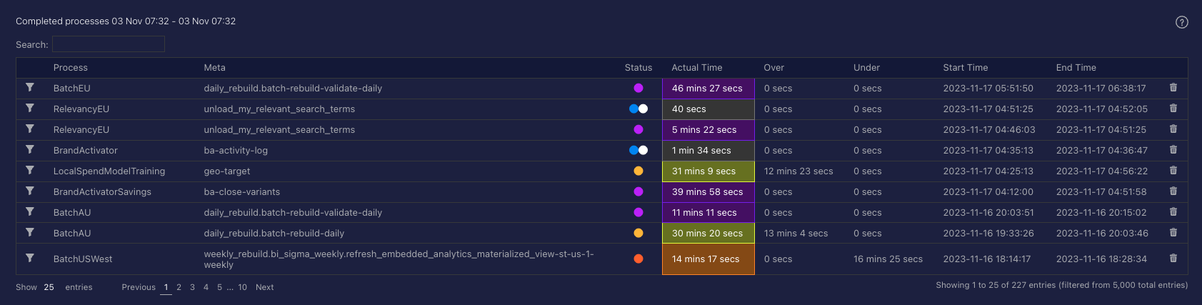
The Completed Processes table shows you the details of all processed that have been sent to the HawkFlow.ai Timed API
Task Processing chart
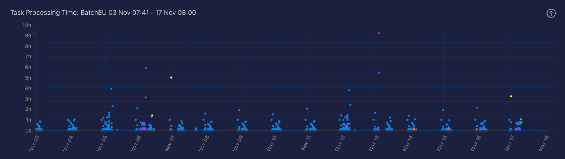
When you send in a process with metadata, that is considered a task. So one process can have many tasks associated with it if you send in varied metadata on the same process. This chart shows you a time series plot of how long each tasks takes to complete. This gives a great view of the overall time characteristics of the way you code is running, which processes take the longest, whether they are consistent, and where you could focus on optimisations or other important technical foundation work.
A process running faster than normal will be represented by an orange bar. A process taking longer than normal to run will be represented by a yellow bar, and a process running with its normal time range will be represented by a blue bar. A failed task will be represented in purple.
Task Time of Day chart
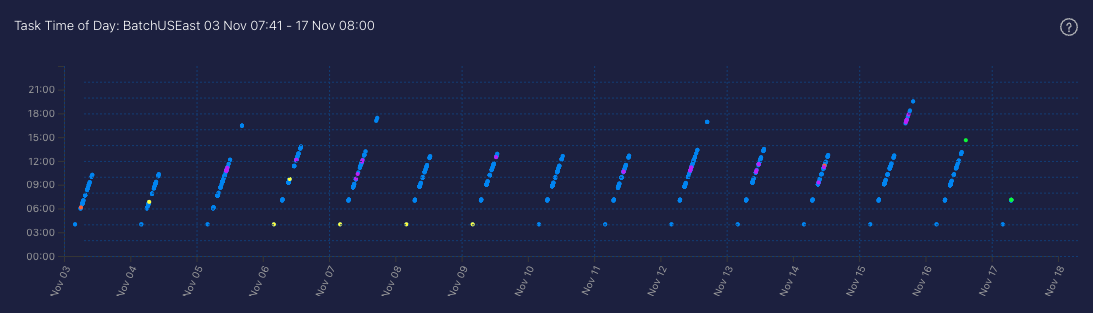
When you send in a process with metadata, that is considered a task. So one process can have many tasks associated with it if you send in varied metadata on the same process. This chart shows you a time series plot of the time of day that each task is sent in to the timed API.
A process running faster than normal will be represented by an orange bar. A process taking longer than normal to run will be represented by a yellow bar, and a process running with its normal time range will be represented by a blue bar. A failed task will be represented in purple.
Number of Processes chart
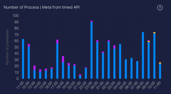
This chart allows you to recognise patterns over time in how many processes you are running. You can quickly see if you have a spike or a drop in the number of processes that are running. Often the first sign that there is an issue in your system.
Each bar shows you the number of processes started in the chosen time range.
A process running faster than normal will be represented by an orange bar. A process taking longer than normal to run will be represented by a yellow bar, and a process running with its normal time range will be represented by a blue bar. A failed task will be represented in purple.
Processing Time chart

This chart allows you to recognise patterns over time in the length of time that processes run for. You can quickly see if you have a spike or a drop in the time processes are taking to complete. When used together with the number of processes chart, this allows you to quickly understand if there is an issue in your system.
Each bar shows you the number of processes started in the chosen time range.
A process running faster than normal will be represented by an orange bar. A process taking longer than normal to run will be represented by a yellow bar, and a process running with its normal time range will be represented by a blue bar. A failed task will be represented in purple.