HawkFlow.ai UI pages components
Dashboard
The Dashboard page is designed to give you a quick understanding of how your entire system is running.
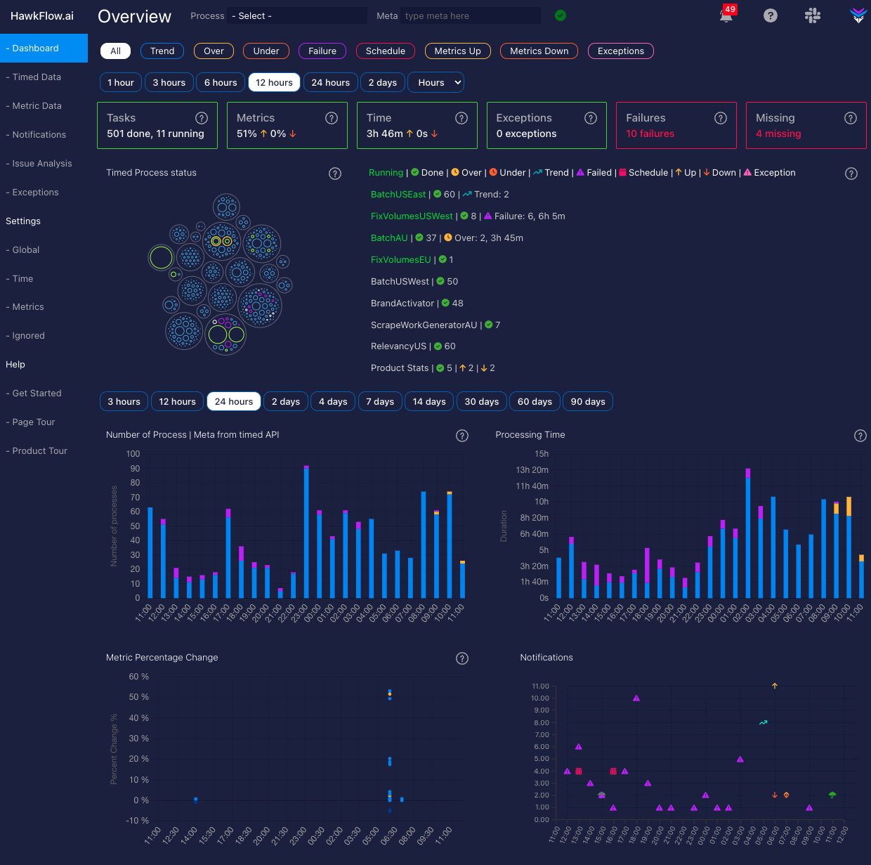
Dashboard widgets

The alert widgets give you a quick glimpse at the state of your system, letting you know whether processes are running on time, throwing exceptions, failing, or have gone missing entirely.
The processes widget shows you how many processes have completed within the selected time range, and it will also show you if any processes are running at the current time.
The metrics widget shows you the total percentage movement up and down of all your metrics within the selected time range.
The time widget shows you the total processing time from all your processes within the selected time range.
The exceptions widget shows you the number of exceptions that have occurred within the selected time range.
The failures widget shows you the number of process failures that have occurred within the selected time range.
The missing widget shows you the number of processes that have been detected as missing within the selected time range. See time settings to learn more about how HawkFlow.ai detects schedules for your scheduled processes.
Rings Chart
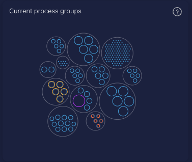
The rings chart is designed to quickly show you the status of all your processes.
Each large outer ring represents a unique process name, and its size represents the sum of the inner rings total time. The inner rings represent different process / meta combinations for the parent process.
The size of the ring represents the time that it took to run. The ring will be blue if it runs within the expected time.
If the process completed faster than normal, then there will be an orange inner ring of which the size will represent how much faster than normal it has run.
If the process is taking longer than normal to run, then there will be a yellow outer ring, of which the size will represent how much longer than normal the process has taken to run.
A purple ring represents a failed run of a process, and a green ring represents a process that is running at that moment in time.
Dashboard Summary
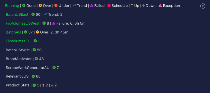
The dashboard summary is the first place you should look along with the rings chart for a quick overall status of everything you are sending in to Hawkflow. It will show you what is running, what has recently completed, how many successful tasks ran, and any issues that occurred.
Number of Processes chart
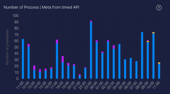
This chart allows you to recognise patterns over time in how many processes you are running. You can quickly see if you have a spike or a drop in the number of processes that are running. Often the first sign that there is an issue in your system.
Each bar shows you the number of processes started in the chosen time range.
A process running faster than normal will be represented by an orange bar. A process taking longer than normal to run will be represented by a yellow bar, and a process running with its normal time range will be represented by a blue bar.
Processing Time chart

This chart allows you to recognise patterns over time in the length of time that processes run for. You can quickly see if you have a spike or a drop in the time processes are taking to complete. When used together with the number of processes chart, this allows you to quickly understand if there is an issue in your system.
Each bar shows you the number of processes started in the chosen time range.
A process running faster than normal will be represented by an orange bar. A process taking longer than normal to run will be represented by a yellow bar, and a process running with its normal time range will be represented by a blue bar.
A failed process will be represented by a purple bar.
Metrics Percentage Change chart
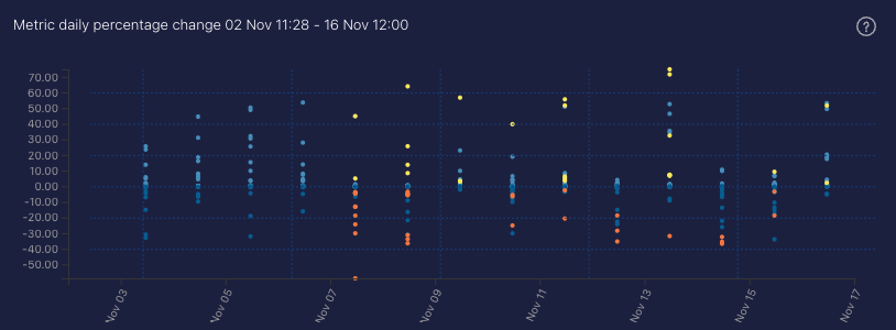
The Metrics percentage change chart shows a historical timeline of all the metrics that you are sending in to Hawkflow and the percentage chart over each time period you have selected in the chart.
- A yellow point on the chart denotes that a record percentage move up has been made.
- An orange point on the chart denotes that a record percentage move down has been made.
A great chart to quickly see if you have any issues that you need to look in to. Clicking a point on the chart will take you through to the metrics page in the app and filter by the process that you clicked in the chart.
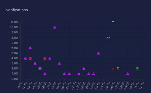
Notifications chart
The Notifications change chart shows a historical timeline of all the notifications that you have received from Hawkflow, even if they have been acknowledged. Clicking on an icon in the chart will take you through to the notifications page in the app and filter by the notification that you clicked in the chart. For a detailed look at what each of the icons mean, take a look at the notifications page here in the docs.