HawkFlow.ai UI pages components
Raw Data Page
The raw data page lets you see the details of every process that you have sent the HawkFlow.ai Timed API.
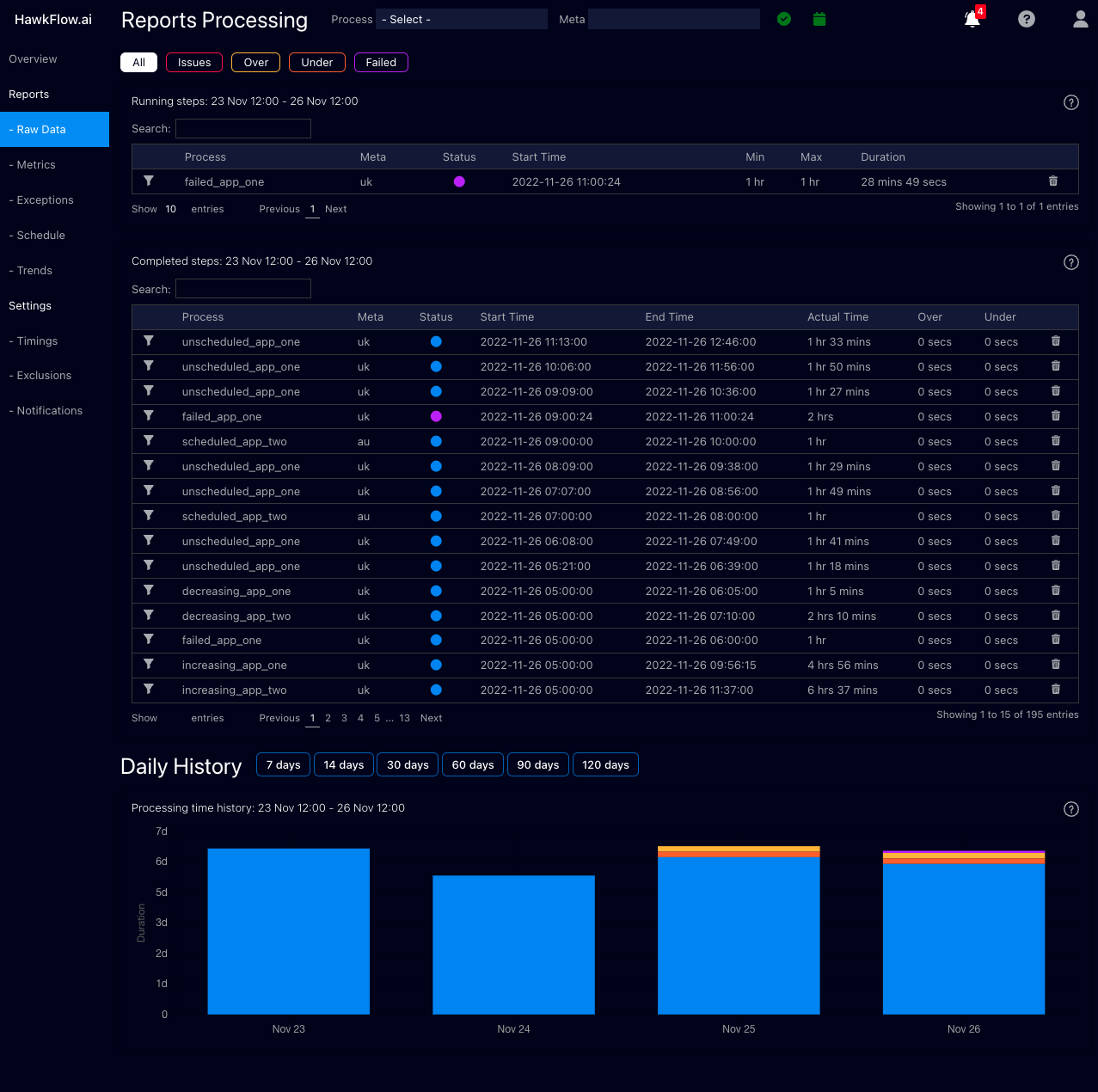
Running
The running table shows the details of any process sent to the Timed API that is running at the time you view it.
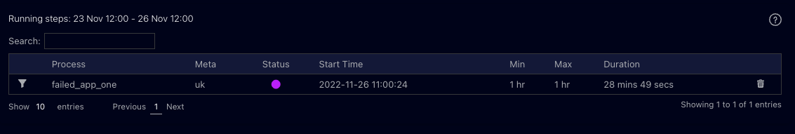
Completed Processes
The Completed Processes tables shows you the details of all processed that have been sent to the HawkFlow.ai Timed API
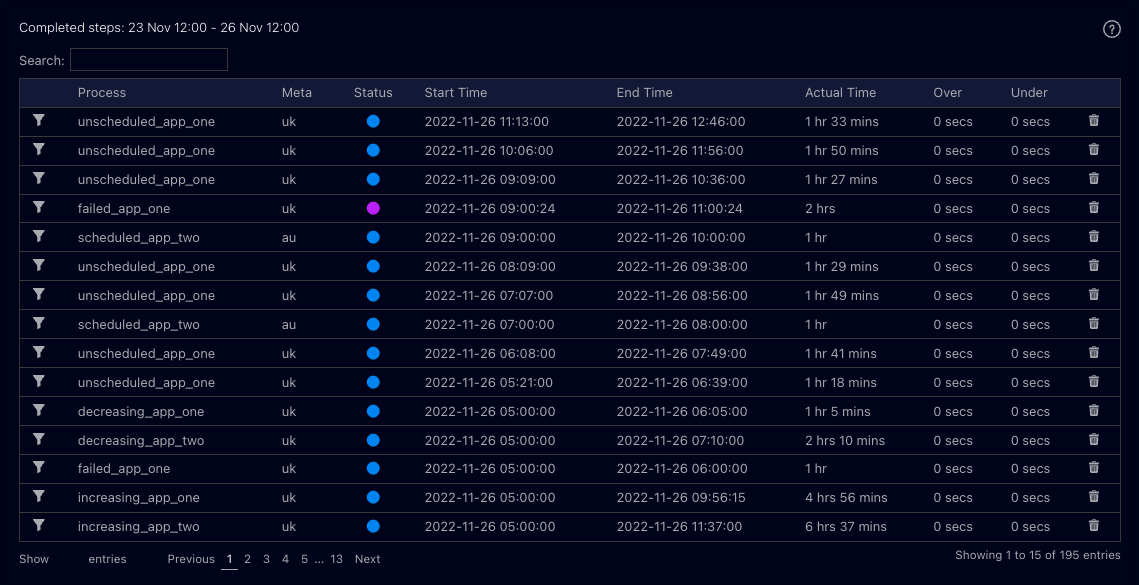
Daily History
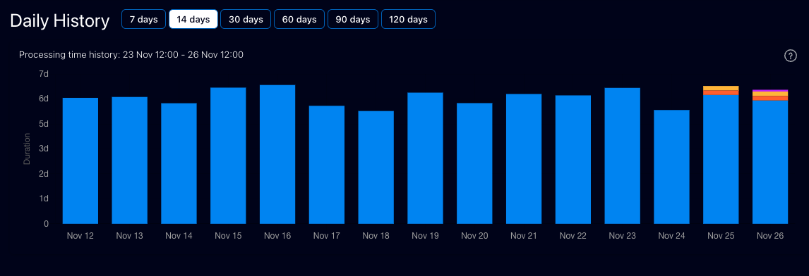
This chart allows you to recognise patterns in the length of time that processes run for. You can quickly see if you have a spike or a drop in the time processes are taking to compelte. When used together with the number of processes chart, this allows you to quickly understand if there is an issue in your system.
Each bar shows you the number of processes started in the chosen time range.
A process running faster than normal will be represented by an orange bar. A process taking longer than normal to run will be represented by a yellow bar, and a process running with its normal time range will be represented by a blue bar.
A failed process will be represented by a purple bar.The chart is design to ...